Air Transformed
with Stefanie Posavec, 2015
What if we could really see and feel the burden that air pollution places on our bodies?
Air Transformed is two series of wearable data objects that communicate this physical burden in different ways. Though they look decorative, they are based entirely on open air quality data from Sheffield, UK. Sheffield is a former steelmaking city and notorious for its bad air.

All images: Steve McInerny. Model: Ashley Grantham
The objects
The first set of objects, Seeing Air, comprises three pairs of glasses, each with three perspex lenses.
Each pair of glasses represents the levels of air pollution on a different day in Sheffield during 2014, averaged over the whole day.

Each lens represents a different pollutant: nitrogen dioxide (brown lens), small particulates (blue lens) or large particulates (green lens). The absolute values in µg/m3 and the percentage of the maximum daily value for the year for each pollutant are etched on each lens.
The days we chose to represent fall at the extremes of the air quality range for the city: a day with high NO2, a day with high particulates and a day of relatively clean air.
The relative levels of each pollutant are communicated by means of patterns etched onto the perspex lenses: the larger and more obtrusive the patterns, the 'cloudier' the vision of the wearer and the worse the air quality that day.
The glasses shown below represent data for 5th November, when NO2 levels were relatively normal but levels of particulates were off the scale (I blame Guy Fawkes).
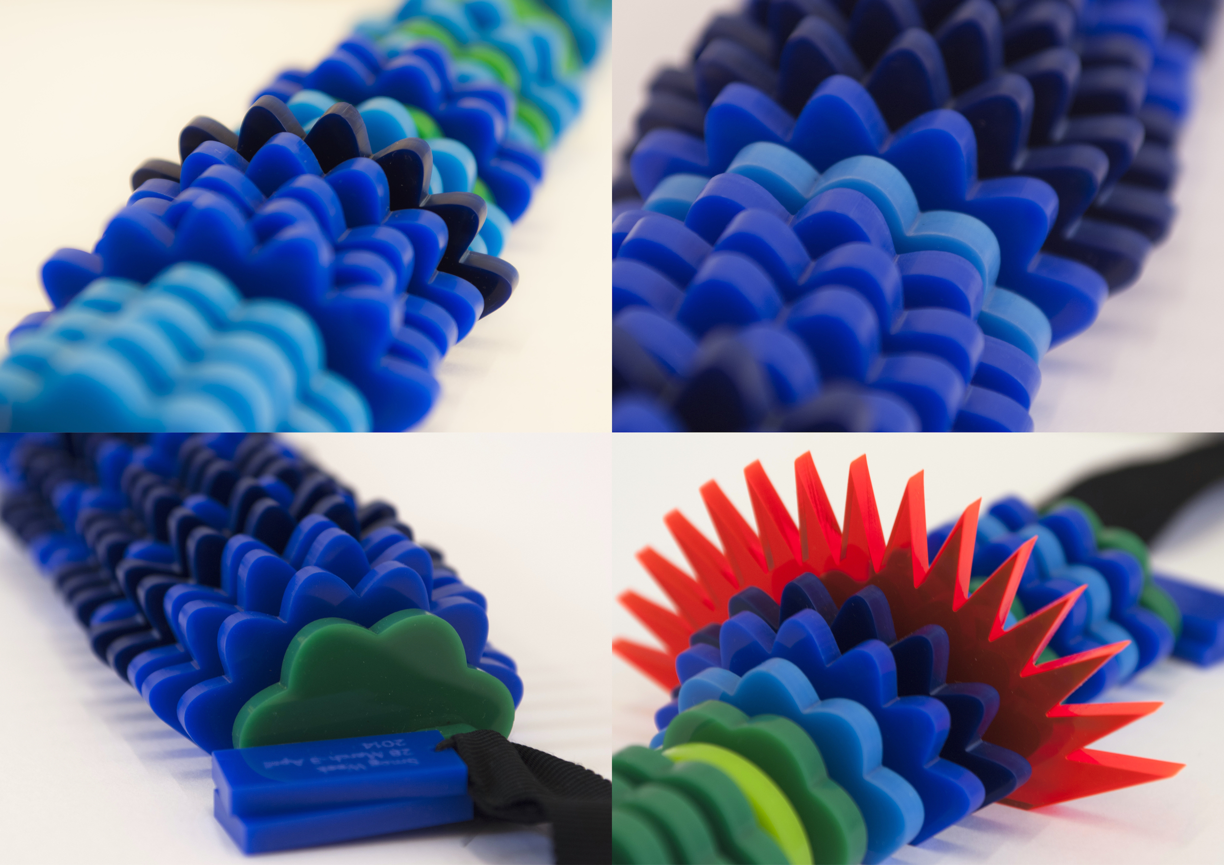
The second set of objects, Touching Air, comprises three necklaces made of perspex segments of different textures.
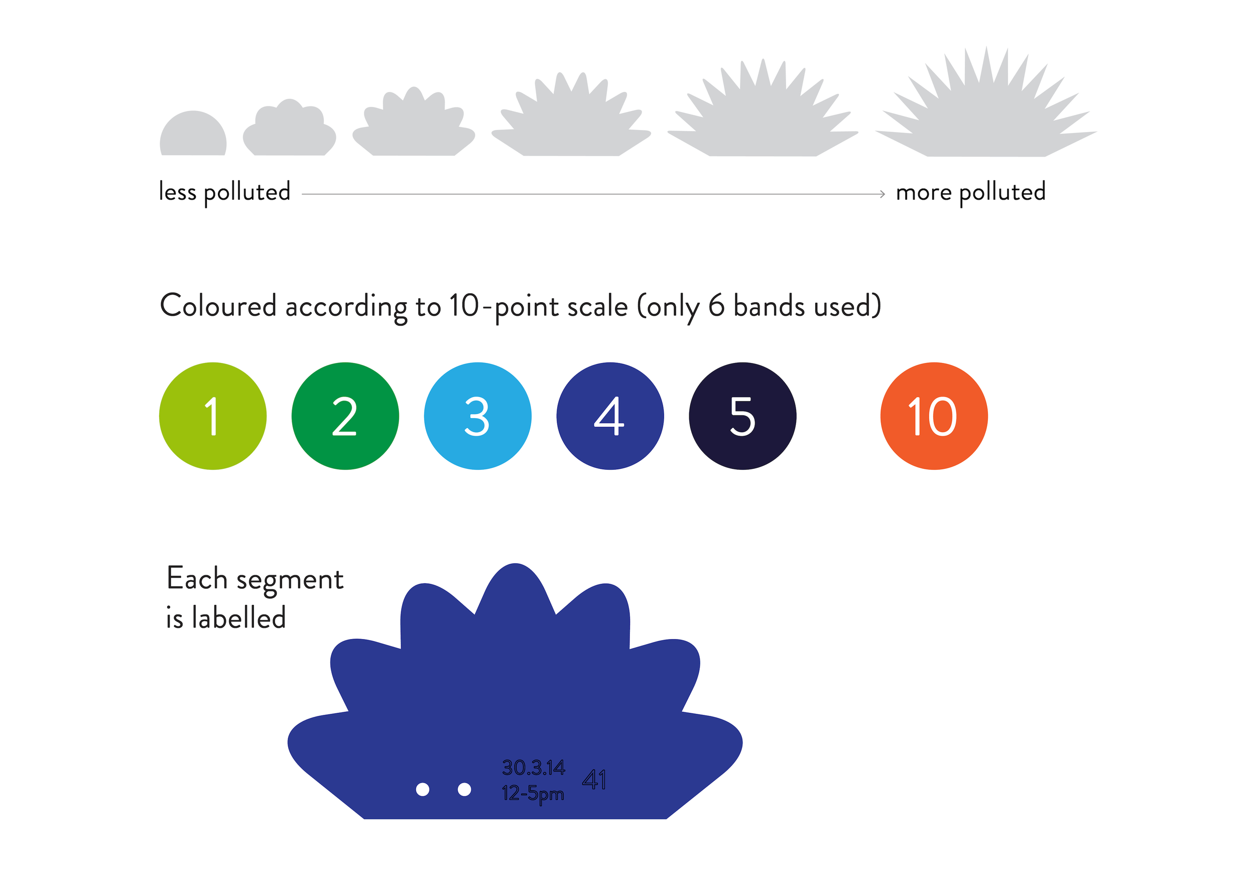
Each necklace represents a week's worth of data from sensors measuring large particulate (PM10) levels. We divided each week of data into 28 six-hour periods and used a perspex segment to represent the average PM10 level in each one. The six-hour periods correspond roughly to morning, afternoon, evening and night of each day.
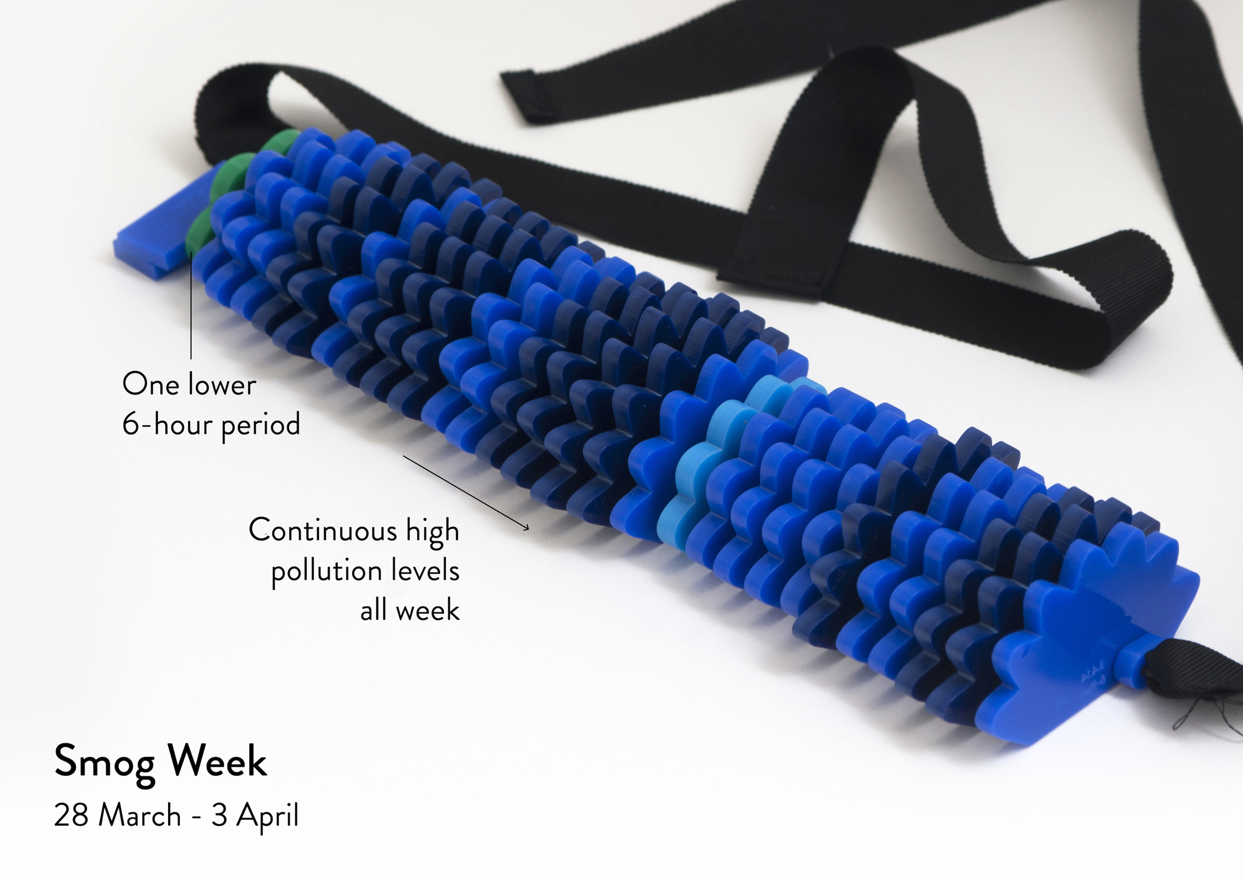
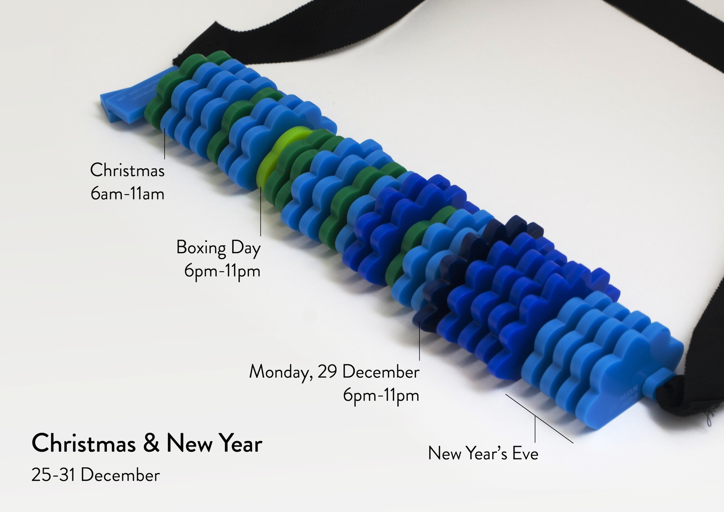
The segments look like little clouds and range in size from small to large and in texture from completely smooth to spiky and sharp to touch; the larger and spikier the segment, the more particulates in the air at that time. The number of divisions is also derived from the particulate readings – the higher the reading, the more 'spikes'. Each segment is colour coded by banded particulate levels, providing visual as well as tactile feedback.
The necklaces sit heavily on the chest, mimicking the physical burden that air pollution places on the heart and lungs. By running the fingers over each necklace, the wearer can literally feel how the air quality in Sheffield went up and down over the course of each week.
Again, we focused on extremes: the shockingly bright orange segment represents the smoke-filled air on the evening of Bonfire Night. (The dark blue segment on the right of the picture is the Saturday night following 5th November. Maybe people who missed the main event were having late Bonfire parties of their own?)
Our process
The pieces are based on open data from up to three air quality sensors around Sheffield, provided by Sheffield City Council. (We accessed the raw data here and here.) The pieces were beautifully designed by Stefanie, while I handled the data.
From the start, we wanted to develop innovative systems for transforming data into physical forms and this was something we worked hard to achieve: for example, the size, number of divisions and roundness / sharpness of spikes on every necklace segment is precisely calibrated to the PM10 levels. The absolute values in µg/m3 are etched on each lens and on every necklace segment.
Though the objects are intricate, nothing is ornamental: everything is richly encoded with data.
The commission
The pieces were commissioned by Better With Data, the Sheffield wing of the Open Data Institute, as part of their AirQuality+ project. Our task was to create artworks using open air quality data to inspire public engagement with the issue of air pollution.
The pieces were presented at the AirQuality+ launch event in Sheffield in January 2015 and will be on display at the Sheffield Institute of Arts during February and March 2015 alongside works by the other commissioned artists: Kasia Molga and Adrian Godwin, and Kingsley Ash.
Air Transformed was covered by WIRED, Flowing Data and Visualising Data, among many others